


Genesis started Genesis Pro Painting with a simple belief: homeowners deserve a painting experience that feels clear, respectful, and properly handled.
His path in the painting industry began with the work itself. Over time, he saw how much homeowners were affected not only by the finished result, but by the communication, preparation, cleanliness, and trust behind the project.
That became the standard for Genesis Pro Painting. The company was built to serve homeowners who care about craftsmanship, clear expectations, and having their home treated with respect from the first conversation to the final walkthrough.
Today, Genesis leads the company with a focus on integrity, accountability, and doing the job the right way.
Genesis Pro Painting helps homeowners in Westchester County and select Fairfield County communities with painting and related home improvement services built around clear communication, careful preparation, clean protection, and craftsmanship.
Whether the project is inside your home, outside your home, or focused on a specific surface like cabinets, wallpaper, decks, drywall, or trim, our goal is to make the process feel organized and properly handled from start to finish.
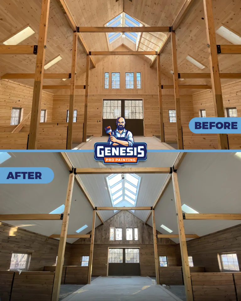
Refresh rooms, walls, ceilings, trim, doors, and interior spaces with careful preparation, clean protection, and clear expectations.
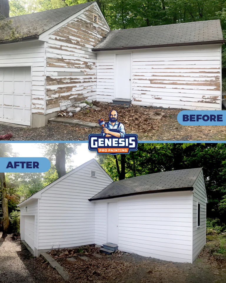
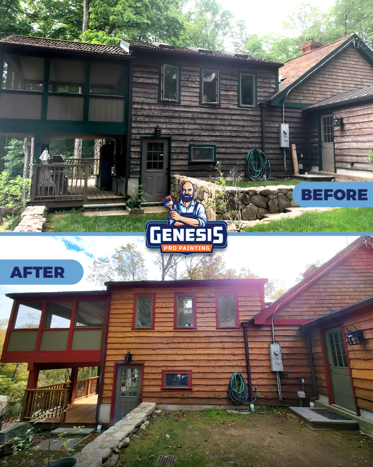
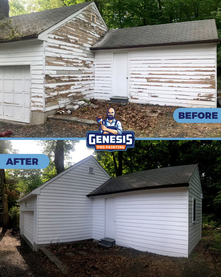
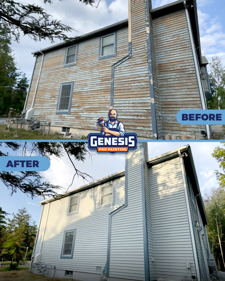
Improve curb appeal and protect exterior surfaces with washing, preparation, siding painting, trim painting, and detailed finish work.
Update kitchens, built ins, and cabinet surfaces with a refinishing process focused on preparation, clean handling, and a smooth finished appearance.
Add texture, pattern, and character to selected rooms with careful wall preparation, layout planning, and clean installation.
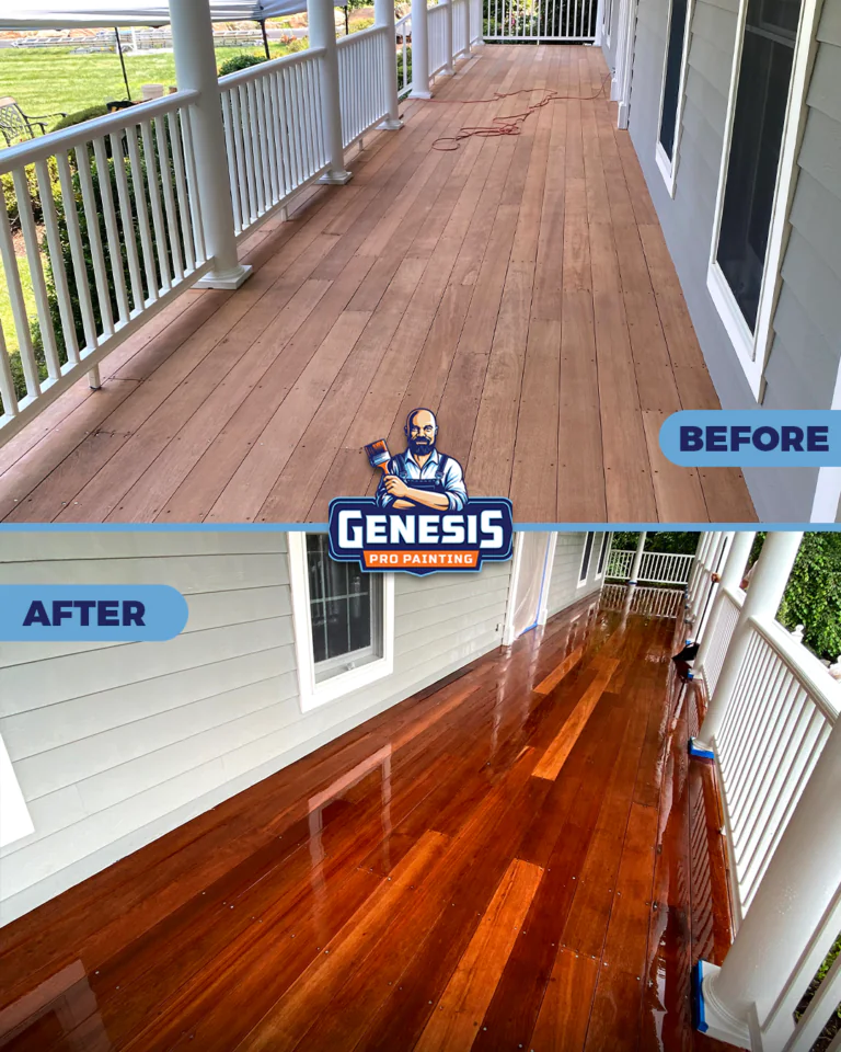
Clean, prepare, stain, and refinish deck surfaces, railings, stairs, and related outdoor wood areas.
Clean appropriate exterior surfaces to remove dirt, buildup, mildew, and surface contamination before painting or as part of home maintenance.
Repair visible wall and ceiling imperfections before painting so the finished result looks cleaner and expectations are clear.
Address trim, rotted wood, loose components, and minor repair needs connected to painting projects.
Get help with paint colors, finishes, room flow, furniture placement, window treatments, and design details connected to your painting project.
Explore recent interior, exterior, cabinet, wallpaper, deck, and home painting projects completed by Genesis Pro Painting for homeowners in Westchester County and nearby Fairfield County.
Each project reflects careful preparation, clean protection, clear communication, and a finished result designed to make the home feel cared for.
Whether you are planning interior painting, exterior painting, cabinets, wallpaper, or a full home refresh, the next step is a clear consultation so we can understand the scope and guide you properly.